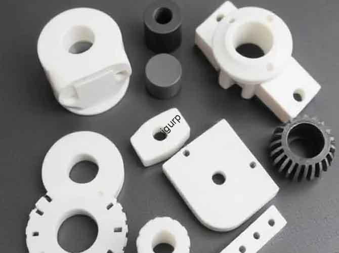
Introduction
Prototype models—used for design validation, client presentations, or functional testing—often need coloring to mimic final products, enhance visual appeal, or highlight design details. The answer to “Can prototype models be colored?” is a resounding yes. However, success depends on choosing the right timing and method. This article breaks down three core coloring stages, key techniques, material compatibility, and practical tips to help you achieve consistent, high-quality results.
1. Coloring Before Lamination: Lay a Precise Color Foundation
Coloring before lamination focuses on prepping the prototype’s base surface, ensuring the final color aligns with design requirements, such as Pantone standards. Two main methods dominate this stage, each ideal for specific prototype types.
Ink Blending for Patterned or Printed Prototypes
If the prototype’s surface needs patterns, like logos or textures, or a uniform color base, you should adjust ink colors before printing or applying the pattern. This process uses standard color references to mix inks to the exact tone, avoiding post-lamination color mismatches.
The step-by-step process begins with referencing a color standard, such as a Pantone Color Chart, to confirm the target hue, saturation, and brightness. Next, you mix base inks in precise proportions. For example, a light blue might require 60% blue, 30% white, and 10% black in a CMYK system. You then conduct a trial print on a small sample of the prototype material, like ABS or resin, and compare it to the target color. Finally, you adjust the ink ratio, perhaps adding 5% more white for a softer tone, and retest until the match is perfect. This method is best for prototypes with detailed patterns, such as consumer electronics housings with brand logos, architectural models with texture, or parts requiring brand-specific colors.
Primer Color Adjustment for Base Tone Alignment
For prototypes that need lamination, you should spray a primer first and add color toners, like color essence, to the primer to match the final desired base color. This creates a uniform underlayer that enhances lamination color vibrancy.
A practical example helps illustrate this. To create a wood-grain prototype, you would start with a clear or light beige primer. You would then add brown color essence, using about 1–2 drops per 100ml of primer, to match the warm tone of natural oak. You then spray the primer evenly on the prototype, ensuring no streaks. This base ensures the subsequent wood-grain lamination film blends seamlessly. This method is best for textured prototypes like wood-grain furniture models or stone-effect architectural components, or for parts where the lamination film needs a complementary base.
2. Coloring During Lamination: Simplify with Pre-Colored Materials
Coloring during lamination leverages pre-colored or composite lamination films to skip complex pre-painting steps. This method is fast, cost-effective, and ideal for prototypes needing consistent color across large batches.
Choose Pre-Colored Lamination Films
The market offers a wide range of colored lamination films, each with unique properties to match prototype needs. For instance, transparent PVC film is low cost, easy to apply, and offers good scratch resistance, making it ideal for prototypes needing subtle color tints, like transparent device covers. Colored PET film provides a full spectrum of colors and has high heat resistance up to 120°C, making it tear-resistant and suitable for functional prototypes such as automotive interior parts or high-temperature test models. Special-effect film, available in metallic finishes like gold and silver or matte and glossy options, enhances visual appeal and hides surface imperfections, making it perfect for presentation prototypes like jewelry models or luxury goods mockups.
As an application tip, for a light blue consumer electronics prototype, you can skip pre-painting and directly apply a light blue PET film. This cuts coloring time by 50% and ensures uniform color across all parts.
Composite Color Mixing for Fine Tones
For prototypes needing nuanced colors, such as soft pastels or gradient effects, you can layer multiple films to blend tones. The base film provides the main color, while additional transparent or tinted films adjust depth and gloss.
To create a gradient pink prototype, you would apply a thin layer of light pink PET film as the base. You would then add a transparent gloss film with a subtle pink tint on top. This deepens the color slightly and adds shine. For a gradient effect, you can trim the top film to cover only 70% of the prototype, blending the light pink base with the enhanced top layer. This method is best for design-focused prototypes, such as fashion accessories or toy models, where color depth and texture matter.
3. Coloring After Lamination: Fix Defects and Adjust Tones
Even with careful pre- and during-lamination coloring, prototypes may need touch-ups. This stage focuses on correcting flaws and modifying colors without damaging the lamination.
Local Repair and Color Correction
Common issues like uneven color, such as darker edges, can be solved by using a pigment matching the lamination film color. You apply a thin layer with a fine brush, then sand lightly with 400-grit sandpaper to blend. For small defects like scratch marks or color spots, you can use a specialized repair pen matching the film color to fill in the defects. Let it dry for 10–15 minutes, then polish with a soft cloth. A useful tip is to always test the pigment or repair pen on a hidden area of the prototype first to ensure it doesn’t peel or discolor the lamination.
Overall Recoloring for Major Adjustments
If the prototype’s color is drastically off, such as being too dark compared to the design, or needs a full color change, like from red to black, you may need to remove the existing lamination and restart the coloring process. You would first gently peel off the old lamination film, using a heat gun on a low setting to soften the adhesive if needed, but avoid temperatures above 80°C to prevent prototype damage. You then clean the prototype surface with isopropyl alcohol to remove residual adhesive. Finally, you reapply primer if needed and choose a new coloring method to achieve the target color. This method is time-consuming, adding 2–3 hours to the process, and risks damaging delicate prototypes like resin models. Therefore, use it only as a last resort.
Conclusion
Coloring prototype models is not only possible but a critical step in creating realistic and visually appealing designs. By understanding the three core stages—before, during, and after lamination—you can select the most efficient and effective method for your specific project. Whether you need precise ink blending for brand colors, the speed of pre-colored films for large batches, or targeted touch-ups for final perfection, the techniques outlined here will help you achieve professional, high-quality results every time.
FAQ
Can I use regular spray paint to color a laminated prototype?
No. Regular spray paint will not adhere properly to lamination films like PET or PVC and may peel off. You should only use pigment or repair pens specifically designed for the film material. Always check the manufacturer’s recommendations first.
Is it better to color before or during lamination for large-batch prototypes?
Coloring during lamination with pre-colored films is generally better for large batches. It is faster, eliminates the need for individual painting, ensures uniform color across all parts, and significantly reduces labor costs. This is critical for batches of 50 or more prototypes.
Can I achieve Pantone-matched colors with composite film layers?
Yes, it is possible but requires precision. You should start with a base film that is close to the desired Pantone color and then add thin, tinted films to adjust. Test each layer with a Pantone color meter to ensure accurate alignment. This technique works best for solid colors, not gradients.
Discuss Your Projects with Yigu Rapid Prototyping
At Yigu Rapid Prototyping, we believe prototype coloring should align with the prototype’s purpose—don’t overcomplicate it. For functional test prototypes, we recommend pre-colored PET film for its speed and durability. For client presentation prototypes, we combine precise ink blending with composite film layers for the perfect texture and color. Our team always tests color samples first to avoid major adjustments and ensure the best result for your project.
Contact Yigu Rapid Prototyping today to discuss your project. Let’s build something great together.